
Campus Connext
About the Project
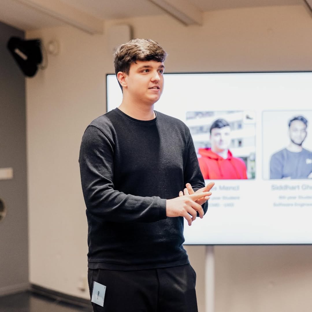
It started at a McDonald's. Me and my friend Sidd — who I'd met during our internship at New Designers — were sitting across from each other, throwing ideas around, and somewhere in that conversation our thinking started to align. We both felt it. We stood up, went back to the internship office at around 10pm, and spent the rest of the night in a full-on ideation session — sketching, brainstorming, connecting dots. By the end of it, we had a first concept. That concept became Campus Connext.
After that night, we called in people we trusted. Luca joined as our backend developer, and Arina and Elioth came on board as UX designers. Five people, one shared frustration, and a whole lot of belief that student life could be better.
Where It All Began
We weren't consultants brought in to solve a problem — we were living it. As students at The Hague University of Applied Sciences, we felt the daily friction of juggling a dozen different platforms, missing events we didn't know about, and feeling disconnected from the very campus we were supposed to call home. That personal frustration is what made the difference. We weren't designing for a user persona — we were designing for ourselves, our classmates, and every student who would walk through those doors after us. That's a very different kind of motivation.
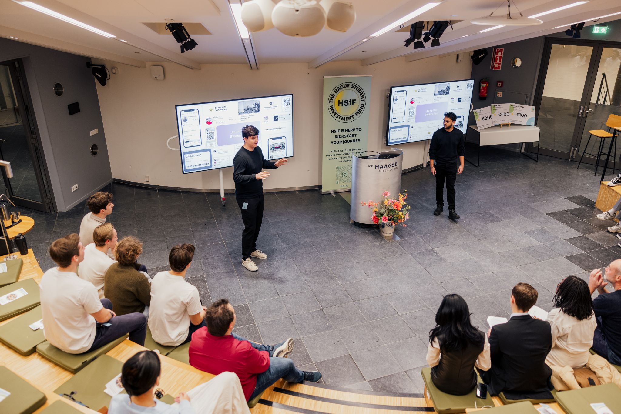
HSiF Pitching Contest
Design Process
From the beginning, we knew that good intentions weren't enough. To build something students would actually use — and love — we needed a real process. We structured our work around the Double Diamond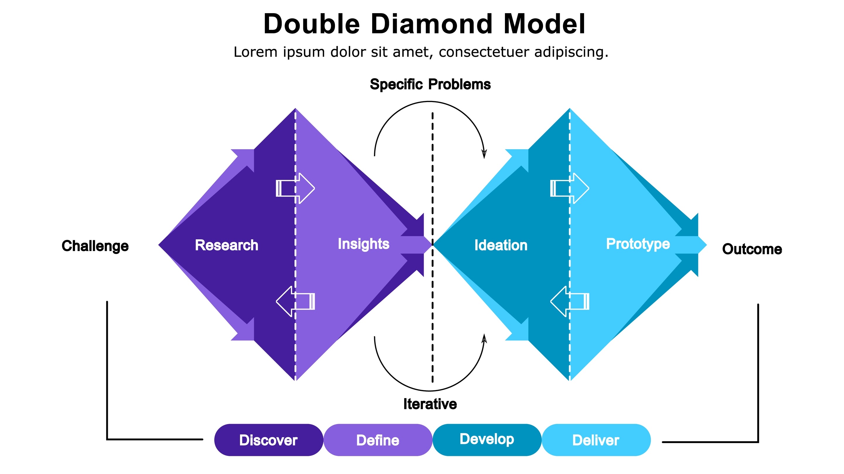 framework, giving us the space to explore widely before narrowing in on the right solution. The problem we were solving — the systemic fragmentationUniversities across the Netherlands use a variety of platforms
where data is scattered, making it difficult for students
and teachers to navigate and find the relevant information they need of student life — was bigger than any single feature could fix.
We worked in Scrum sprints, keeping the feedback loop tight between design and development. I led the UX side, making sure every decision was grounded in what we learned from real students — not assumptions. The goal was never just a working app. It was an app that felt effortless to use. Here's how we got there.
Research
Our research phase was extensive, combining desk research, competitive analysis, one-on-one interviews, surveys, and focus groups — engaging over 150 participants in total. We began by studying the landscape of existing university digital solutions, auditing competitor platforms and experiencing their shortcomings firsthand — because we weren't outside observers, we were the students.
Students juggle nearly a dozen platforms just to get through the day — and sometimes can't even show their student card at an exam.
Our largest group of participants were students, and the picture they painted was consistent: chaos. The average student at The Hague University juggles nearly a dozen different platforms on any given day — Brightspace for assignments, Osiris for grades, SharePoint for resources, Teams for messaging, WhatsApp for group chats, OnStage for internship applications — and that's before accounting for their university email and student card app. Students described feeling overwhelmed, out of control of their own academic lives, and frustrated by the sheer amount of time lost just navigating between tools. The most telling example? A recurring issue where students arrive to write an exam only to find their student app won't log them in — leaving them unable to show their digital student card at the door.
Conversations with teachers and university staff added another layer to our findings. One organization within the university had long wanted a dedicated space for students to register for campus events, but had never found a viable solution. Rather than pushback, our initiative was met with genuine enthusiasm — our concept sparked interest and support across multiple faculties, giving us early institutional validation before a single screen was designed.
Ideation
With our research findings in hand, we threw ourselves into one of the most energetic phases of the project. As two designers who had been studying UX at The Hague University, we didn't just apply what we'd learned in class — we lived it. How Might We sessions, Crazy 8s, mind mapping, brainwriting, competitive benchmarking, user journey mapping, sketching, MoSCoW prioritization — we ran it all, and then some.
You won't notice good UX — but you will definitely notice bad UX.
Some sessions were just the two of us, piecing things together late into the evening. Others involved our broader team, and many we ran with real participants — students who shared the same frustrations we did. Each session brought us a little closer to clarity. We didn't know the format from day one; ideation was the process of connecting the dots, one session at a time.
What drove us wasn't just a design brief — it was a genuine desire to change something. Our student lives felt overwhelming, and we wanted to build something that would make life easier not just for us, but for every student who came after us. That purpose kept us focused through the ambiguity. Eventually, a clear direction emerged: a unified digital hub that merges every aspect of student life into one seamless experience. Something students wouldn't even have to think about — because the best UX is the kind you never notice.
Prototyping & Testing
We started where all good design starts: paper. Big, messy, low-stakes paper prototypes that let us explore layout and flow without getting precious about any of it. Once the structure felt right, we moved into lo-fi digital wireframes and ran our first round of testing with a close group of participants. Their feedback was direct and invaluable — and we iterated. Then iterated again. Then once more.
We iterated. Then iterated again. Good design isn't built in one go — it's earned through every round of feedback.
Once the lo-fi held up, we moved into high-fidelity. Our first hi-fi MVP went in front of a larger batch of students — real users, real feedback, real edge cases we hadn't anticipated. We iterated, tested again, and kept tightening the experience until the app didn't just work — it felt effortless. The final benchmarks confirmed what we'd worked toward: Campus Connext outperformed the university's own student app across every metric that mattered.
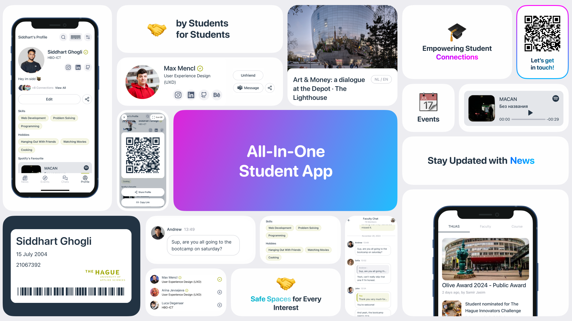
Overview of key features and design concepts
Reflection
Campus Connext is more than a project on my portfolio — it's a chapter of my life. Whether it grows into a scale-up or stays our scrappy side project forever, what it gave me can't be measured in metrics or milestones.
It gave me my best friends. It gave me hunger. It gave me some of the best memories I've made so far, built in late-night sessions, last-minute pivots, and the kind of shared struggle that turns teammates into family. And above everything, it taught me that no matter how high or low you find yourself, you can always make things happen. Anything is possible.
Professionally, Campus Connext gave me the foundation I'll carry into every UX project that follows. It threw me into a fast-paced environment where designers and developers worked side by side — and I learned to thrive in that space. I stopped waiting for the perfect plan and started solving problems on the go, preparing overnight, iterating on real results instead of endlessly theorizing. It shaped the way I work: move fast, stay curious, and always put the user first.